BEI-OS 3.1 — BRAND
The Standard for How We Present
Brand Guide.
How Berg Enterprises looks, reads, and presents itself — on the page, on the screen, and in the field. This edition recodifies the brand in the BEI-OS visual language. The rules have not changed; the way we express them has.
Edition v7.0
2026
Supersedes v6.0
Berg Enterprises, Inc.
Identity
The Logo.
One mark, one configuration. The wordmark and the two arrows lock together as a single unit, and are never recolored, recombined, or redrawn.
Dark ground. White wordmark, full-color arrows. The primary lockup.
Light ground. Black wordmark, full-color arrows. For white and pale surfaces.
The Mark
The BEI mark pairs the BERG ENTERPRISES wordmark with two opposing arrows representing heat in motion. There is no cold — only heat and less of it. When cooling, HVAC systems move heat out of the building, leaving cool air behind. When heating, they operate in reverse, moving heat in. This is the simple premise that BEI was built upon in 1974.
This is the only approved design. Do not alter it.
Palette
Color Palette.
Black carries the brand. Blue and red are the accents that bring it to life; white is contrast and breathing room. The palette reads American without being heavy-handed. Use full saturation (600) for type and accents, tints for fills.
Primary
#1C00FFBEI Blue
#FF0000BEI Red
#000000Black
#FFFFFFWhite
Application Tints
Blue
Section-title accents, active states, dividers, the v3 / Delivery wayfinding track.
Red
Emphasis, location pins, alerts, the v2 / Sales & Estimation wayfinding track.
Neutral
Body text, structural elements, and backgrounds in print and light contexts.
Screen Surfaces — BEI-OS
000
0A0A0A
0F0F0F
1A1A1A
262626
6A6A6A
B4B4B4
FFFFFF
The dark interface ramp the BEI-OS site is built on — base, raised, and sunken surfaces; hairline borders; faint, body, and primary text. This is screen-only and does not replace the brand neutrals above.
Type
Typefaces.
Three faces, three jobs. Barlow is the voice of the brand — display and headlines. Proxima Nova carries the reading. JetBrains Mono is the system face, added in this edition for the technical and structural text that defines the BEI-OS look. Barlow for display, Proxima Nova for body — never the reverse.
Display — Barlow
Federal
MEP.
Weights 800 (sections) · 900 (display). Mixed case. Periods close brand titles.
Body — Proxima Nova
Berg Enterprises provides expeditionary mechanical and plumbing services in hard-to-reach federal and commercial markets.
Weights 300 / 400 / 600 / 700. Fallback: Helvetica Neue, Arial.
System — JetBrains Mono
BEI-OS 3.1
SPRINT-01 / ARCHITECTURE
STATUS: ACTIVE
Weights 400–700. Metadata, labels, code, version stamps, technical readouts.
Type Scale
Hero
Barlow 900 / 56–104px
Statement of Qualifications.
Section
Barlow 800–900 / 32–54px
Our Firm.
Subhead
Proxima Nova 700 / 16–20px
Lines of Operation
Body
Proxima Nova 400 / 14–16px
Body copy for documents, descriptions, and supporting detail.
System / Meta
JetBrains Mono 500 / 10–12px
Updated 05.13.2026 · CST
Signature
The Title Pattern.
BEI section titles follow one formula: a leading word in white, a trailing word in an accent color, and a period. One accent per title. The period is non-negotiable — it is the brand's full stop.
Our Firm.
Lines of Operation.
Select Projects.
// the formula
[white leading word] + [accent trailing word] + "."
System
The Components.
The recurring parts that build every BEI-OS surface. Structure comes from hairlines and a single rail — not boxes, not shadows. Each part has one job.
The Rail
A 3px bar on the left edge of a card. It color-codes content at a glance: white is neutral, blue and red carry the two wayfinding tracks, and the blue-to-red gradient marks joint work.
White
Neutral / default content.
Red
v2 · Sales & Estimation.
Gradient
Joint / cross-track work.
Kicker Label
Section Eyebrow
Use: a square dot plus tracked, uppercase Barlow above every section title.
Chips
Active
Open
Deferred
Use: short status and category tags — filled for primary, outline for secondary.
Code Block
# versioned readout
BEI-OS 3.1 — "Process"
Use: technical readouts, IDs, and system text on the sunken surface.
Numerals
01
02
03
Use: oversized Barlow 900 for phases, steps, and sequence.
Application
Application Rules.
Do
Build primary surfaces on black with Barlow display type.
Title sections with the white word + accent word + period pattern.
Let one accent carry a component; blue and red may share a layout.
Use Barlow for display, Proxima Nova for body, JetBrains Mono for system text.
Structure with hairlines and the rail — not boxes.
Full saturation (600) for type; tints and dark surfaces for fills.
Do Not
No earth tones, pastels, or corporate beige — BEI is bold.
No gradients in proposals or formal documents. The blue-to-red rail is the one sanctioned gradient — system wayfinding only.
Never use Barlow below 12px, or Proxima Nova for headlines.
Never separate the arrows from the BERG wordmark.
No drop shadows, bevels, glows, or decorative effects.
No additional colors without approval.
Voice
Voice & Tone.
We serve the warfighter and other essential federal missions. The stakes are real. We are precise, we are direct, and we say what we mean. Every word earns its place.
We Are
Precise. Details matter, and we focus on them relentlessly.
Direct. Lead with the point. BLUF in internal comms.
Mission-oriented. The warfighter, not the buyer.
Confident. We back what we say with what we build.
We Are Not
Marketers. No buzzwords, no hype, no fluff.
Hedgers. No "may" or "could" when we mean "will."
Salespeople. We design solutions; we do not pitch product.
Amateurs. Our work has our name on it. So does our paperwork.
Discipline
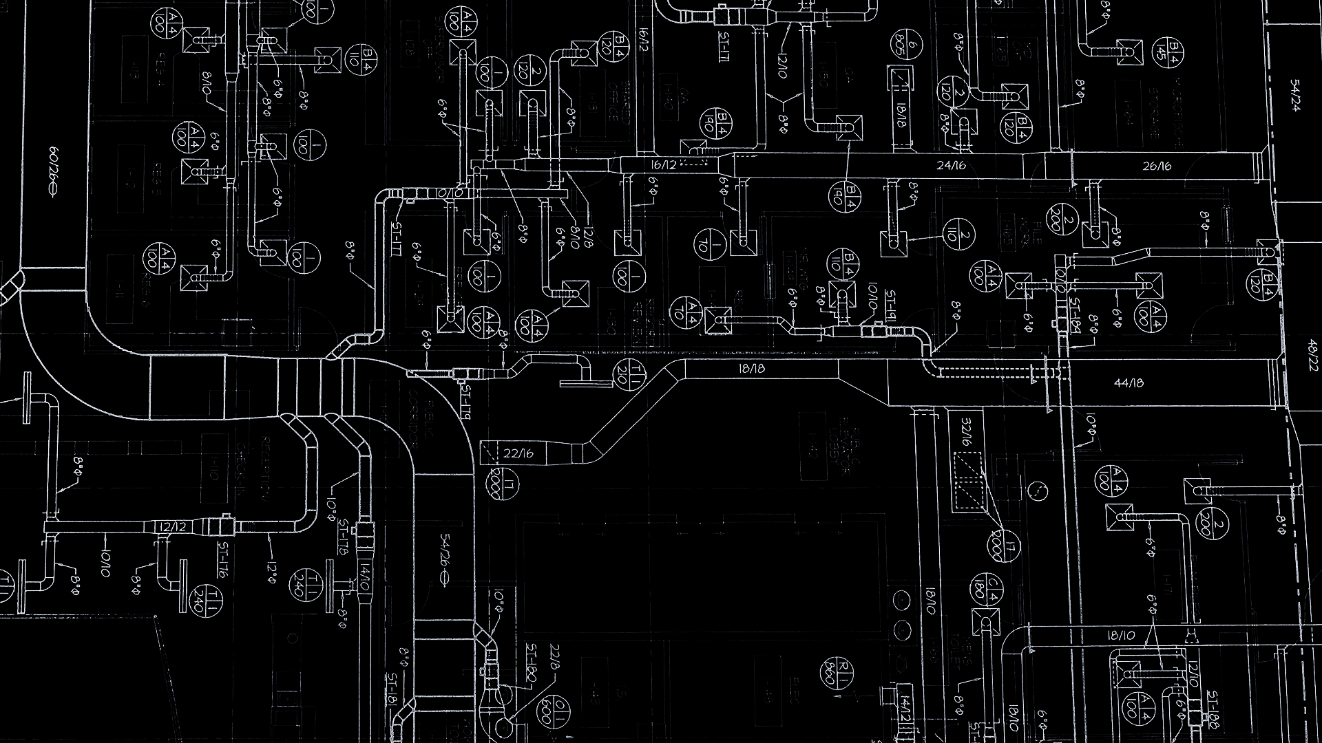
Brand as a Standard.
Most mechanical contractors do not have a brand guide. Adherence to ours is the visual equivalent of a clean duct or pipe run — consistency is proof of attention to detail. Every client-facing document is a preview of the quality the work will carry.
In the Office
Google Workspace is the platform for internal collaboration. Proposals, decks, and reports use BEI templates with the correct typography, color, and logo treatment. How we present internally shapes how we present externally — it is the same standard.
In the Field
Everything we bring to a jobsite — crews, trucks, tooling, PPE — holds a clean and consistent look. The standard is enforced. How we present on site reflects the precision we deliver, and it builds confidence with our clients and theirs.
Personality
The Freedom Eagle.
The Freedom Eagle is the personality side of the brand — who we are when we are not at the table. A crew of patriots, tradesmen, and veterans who take pride in serving the mission. He is not subtle, and he is not for every audience. That is the point.
He lives in internal and culture contexts — never in proposals or formal client documents, where the wordmark and the system carry the brand. He earns his own ground, which is why he sits on a plate of his own, apart from the system.
Internal
Culture
Not for Proposals
The Bottom Line
How we present is how we perform.